Components
Component Display Solutions
Components can be displayed as follows:
On a board
Boards are used to display components that provide an overview for your data. You can use pre-designed layouts to present board content or you can customize a layout to best suit the content presentation needs. When Design mode is on, add a component from the component bar to the board.
In Tools Panels
Tools Panels are used to display components on-demand. This avoids overcrowding a board. In addition, you can access a specific component regardless the board.
When Design mode is on, click on the left, bottom or right of the design area and select a component from the component bar. The component is then displayed on the Tools Panel.
Component Add Options
Components can be added on a board as follows:
Click a component in the component bar
This option is enabled both in the Default and the Smart layout modes:- In the Default layout mode, when you click a component in the component bar, it is positioned in the center of the design area by default and may overlap other components.
- In the Smart layout mode, when you click a component in the component bar, it is positioned sequentially, after other components, without overlapping.
Draw a component frame
This option is enabled only in the Default layout mode.
Resizing and repositioning components is no longer required as the size and shape is determined by your custom-drawn frame. Resizing and repositioning is still available, however. Click on the design area, drag and release to create a frame. The frame is highlighted to indicate the area you are currently working on. Each frame is a designated space that holds a component. On the component bar, click a component to add it to the frame.
Note: If a frame is selected, thus highlighted, selecting a different component from the component bar replaces the one previously added to the highlighted frame. Before adding another component on the board, deselect the highlighted frame by clicking outside it.
Common Component Properties
The component configuration displays properties that are shared by all components.
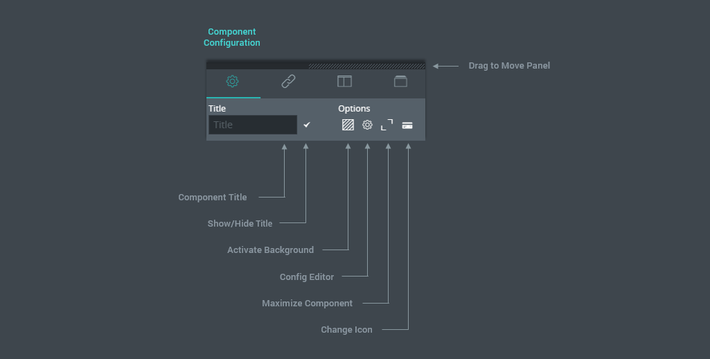
Fig. 3: Component Configuration: Common Properties.
Component Title
The component internal name. This can be used for identification in the Link Editor.
Show/Hide Title
If selected, the component title is displayed in User mode.
Activate Background
If selected, the transparent background of the component is replaced with a solid one.
Config Editor
If selected, the configuration editor icon is enabled in User mode, allowing you to edit settings not accessible by default.
Maximize Component
If selected, the maximize component icon is enabled in User mode, allowing users to expand the component over the entire display area.
Change Icon
The icon assigned to the component. This is displayed for the components added in the Tools Panels. You can keep the default icon or you can change it by selecting one from the icon list or by providing an icon URL.