Retrieve the Data From an Online Service
In this section you will learn to do the following:
- Connect to a financial data service provider.
- Retrieve and process the data in FusionCreator App Builder.
- Store the data in a FusionCreator App Builder cube.
- Visualize the data in FusionCreator App Builder UI in a table and in a time-series plot.
For the purpose of this tutorial, you will use data provided by Quandl, a financial and economic data provider that sources data from multiple publishers and exposes it through an API. To find out more about Quandl visit their website at www.quandl.com.
Connect to the Data Provider
You will connect to Quandl to retrieve historical data about the Facebook shares. You can adapt this workflow to retrieve data for any shares you have access in Quandl. You can also use any data provider that exposes the data through an API.
To connect to Quandl
- Navigate to quandl.com and sign in for an account. You can use an existing Google, Github or Linkedin account. You need this account to get a unique API key that you will use with your data requests.
- After you log into Quandl, go to your Account Settings > API Key to find your API key. Copy it to a convenient place.
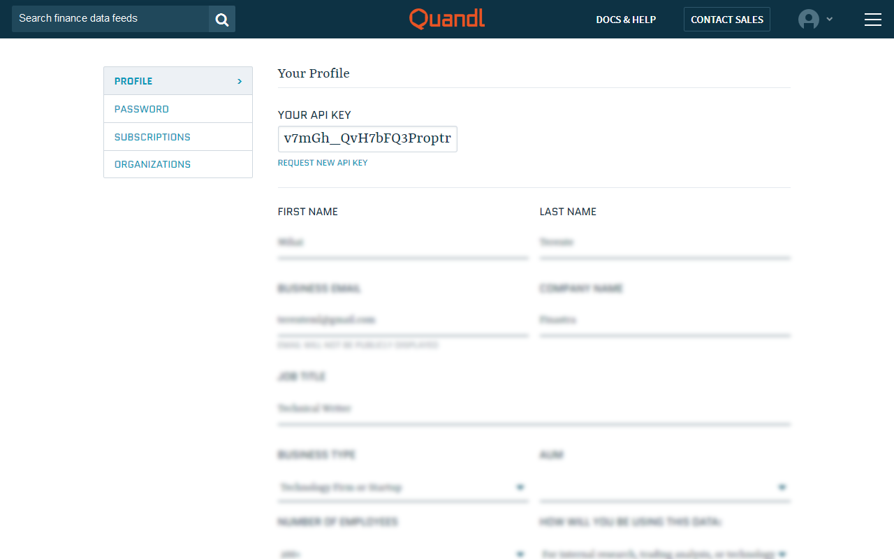
Fig. 44: The Quandl API key.
- In FusionCreator App Builder, create a new workspace and name it Option Pricer.
- Go to Data source editor and click Data Manipulation. The welcome page of the Data Manipulation Tool opens in a new tab. Here, you retrieve and process the data from Quandl.
- Create a new pipeline and name it Quandl-FB. Optionally, add a description of the pipeline.
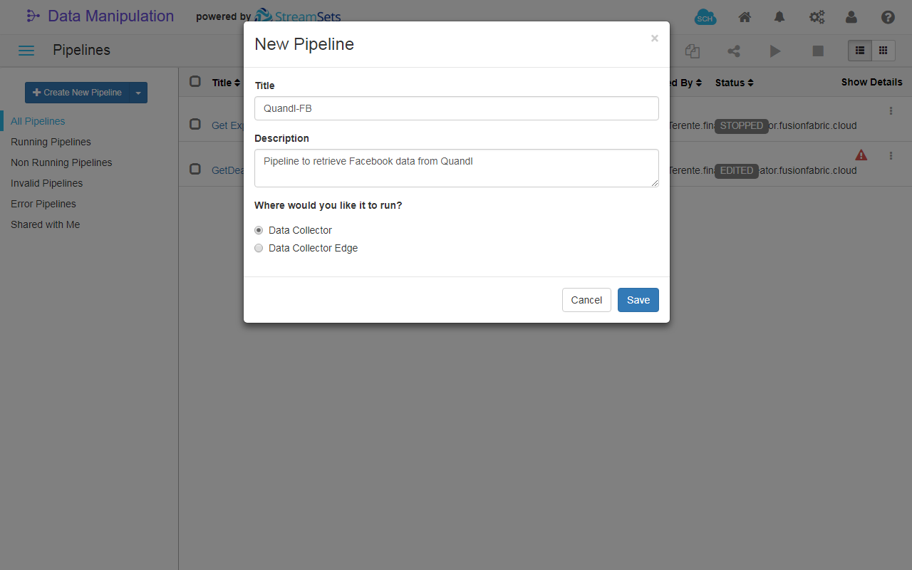
Fig. 45: Create New Pipeline dialog box.
- Add an HTTP Client origin and configure it:
- (Optional) In the General tab, name it
Quandl. - In the HTTP tab fill in the fields as follows:
- Resource URL:
https://www.quandl.com/api/v3/datasets/WIKI/FB/data.csv?api_key=<your_api_key>. Replace<your_api_key>with your Quandl key. - Mode:
Batch. - Leave the defaults for the rest of the fields.
- Resource URL:
- In the Data format tab, adjust the following fields:
- Data format:
Delimited - Header Line:
With Header Line - Max Record Length (chars):
10240
- Data format:
- (Optional) In the General tab, name it
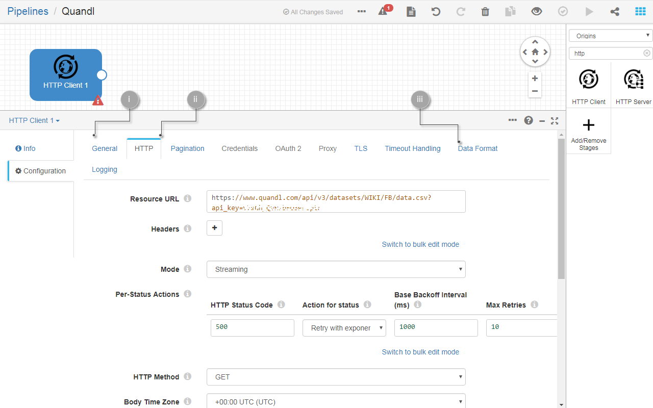
Fig. 46: Configure the Quandl HTTP client.
- Run the pipeline in Preview mode to test the data retrieval. Select the Table view to display your data in browser. To stop the preview mode, click Close preview.
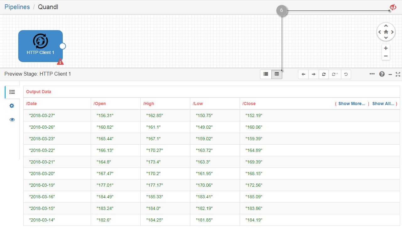
Fig. 47: Preview the data retrieved with the Quandl HTTP client.
You have concluded the configuration of the data retrieval. Your pipeline is ready to be further configured for data processing.
Notes
- In this section you used time-series data from Quandl. The other format available is tabular.
- You used the data in CSV format. Feel free to explore the other formats available by changing the extension of the retrieved data. This is explained in the Quandl documentation.
Process the Data
To process data from Quandl in App Builder
- Add an Expression Evaluator processor to the pipeline and link its input to the Quandl origin’s output. This processor calculates and writes the results to a new or an existing field. This allows you to add a new field to your data that will store a unique ID for each record. Find out more about Expression Evaluator in the documentation.
- Configure the Expression Evaluator as follows:
- Go to the Expression tab and fill in the following fields:
- Output Field:
/ID. - Field Expression:
${record:value('/Date')}. This expression copies the date from theDatefield and lets you use it as a unique ID. This works since the data set does not contain multiple rows for the same date. - Leave the defaults for the rest of the fields.
- Output Field:
- Go to the Expression tab and fill in the following fields:
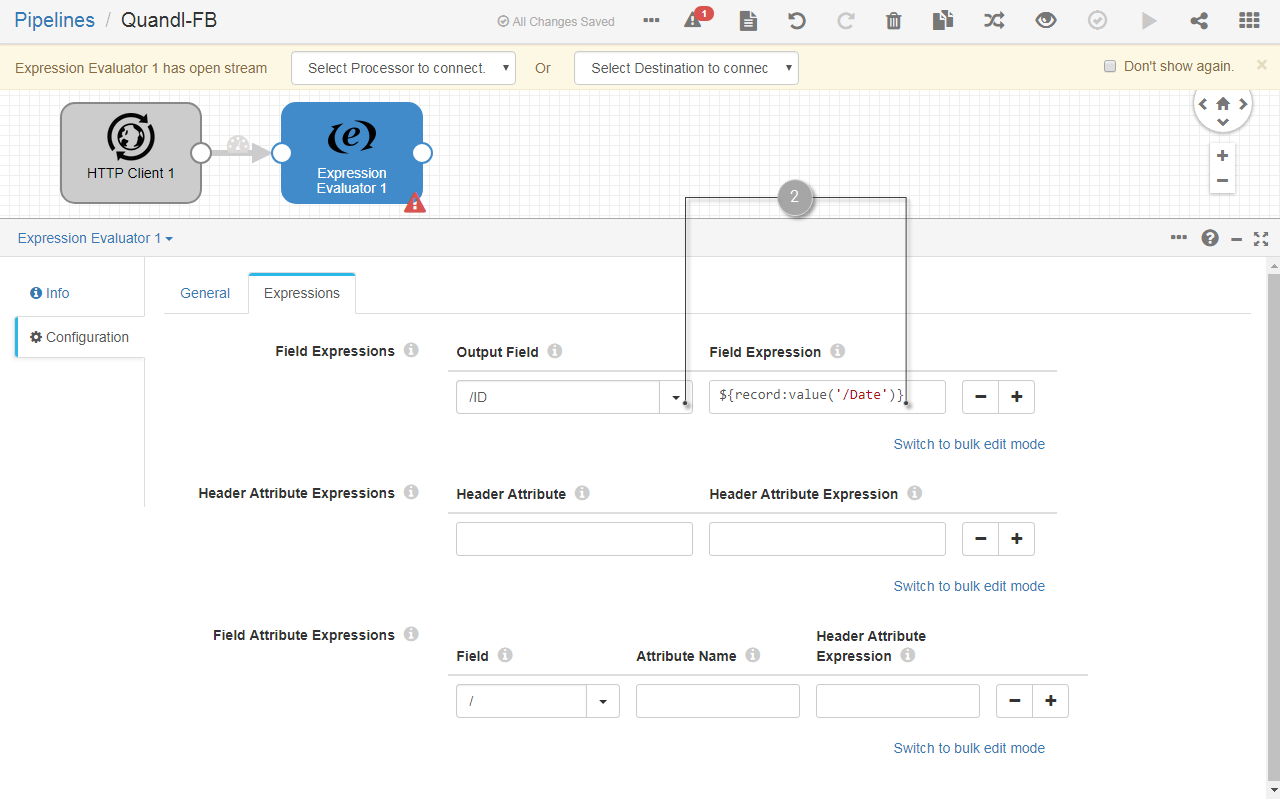
Fig. 48: Configure the Expression Evaluator processor to generate a unique ID for the records.
- (Optional) Run the pipeline in preview mode to verify that the unique ID field is added to the data.
- Add a Field Type Converter processor to your pipeline and link its input to the Expression Evaluator 1 processor’s output. This is the last mandatory processor before importing the data into a cube. It allows you to define the field type for each field in you data. Find out more about the Field Type Converter processor in the documentation
- Configure the Field Type Converter processor as follows:
- Go to the Conversions tab and fill in the following fields:
- Conversion Method:
By Field Name. - Configure the numeric fields by adding a group of Fields to convert and selecting all the numeric fields to Convert to Type:
DOUBLE. Don’t include here the/IDfield, keep it in the defaultStringtype list. The numeric fields are:/Open,/High,/Low,/Close,/Volume,/Ex-Dividend,/'Split Ratio',/'Adj. Open',/'Adj. close',/'Adj. Volume'. - Configure the date fields by adding a second group of Fields to convert and selecting the
/Datefield to Convert to type:DATE. Format the date asyyy-MM-dd.
- Conversion Method:
- Go to the Conversions tab and fill in the following fields:
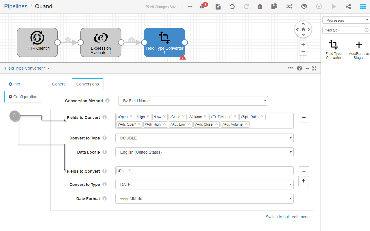
Fig. 49: Configure the Field Type Converter processor to define the field types of your data.
- Add a Field Renamer processor to your pipeline and link its input to the Field Type Converter 1 processor output. This allows you to rename the fields whose names contain unsupported characters, such as
'or.. - Configure the Field Renamer processor as follows:
- Go to the Rename tab and fill in the following fields:
- Add a pair of source - target fields in the Fields to Rename section for each of the following fields:
/Ex-Dividend,/Split Ratio,/'Adj. Open',/'Adj. High',/'Adj. Low',/'Adj. Close',/'Adj. Volume'. The target field name must not contain spaces or punctuation marks and they must start with/. - Leave the defaults for the rest of the fields.
- Add a pair of source - target fields in the Fields to Rename section for each of the following fields:
- Go to the Rename tab and fill in the following fields:
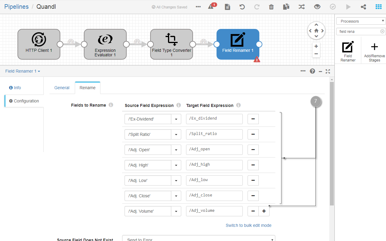
Fig. 50: Configure the Field Renamer processor to rename the fields that contain unsupported characters.
The configuration of your data retrieved from Quandl is now finished. You are ready to store them in a cube.
Store the Data in an App Builder Cube
[To store the data] {.text-title}
- Add a Cube insert destination to your pipeline and link its input to the Field Renamer 1 processor’s output. This will allow you to store the data into a FusionCreator App Builder cube from where you can further create reports and visualize your data.
- Configure the Cube insert destination as follows:
- Go to the Cube and fill in the following fields:
- Cube name:
Quandl-FB. - Create report:
ALWAYS. This will automatically create a report for your cube, with the same name as the cube, each time you run the pipeline. - Generate missing columns: deselect this option. You add the fields manually to avoid problems with unsupported characters in the names of the fields.
- In the Key Fields group, fill in the following fields:
- Source Field: select
/IDfrom the list. - Type: select
STRINGfrom the list.
- Source Field: select
- In the Attribute Fields group, fill in the following fields:
- Source field: select
/Datefrom the list. - Type: select
DATEfrom the list.
- Source field: select
- In the Value Fields group, add all the numeric fields that you defined in the Field Type Converter 1 processor. Take care to select those fields that you renamed in the
Field Renamer 1processor. These are the following data fields:/Open,/High,/Low,/Close,/Volume,/Ex_dividend,/Split_ratio,/Adj_open,/Adj_close,/Adj_volume'.- Type: select
DOUBLEfor each data field.
- Type: select
- Cube name:
- Go to the Cube and fill in the following fields:
- Run your pipeline. If all went fine, the message is displayed: Pipeline job has been finished.
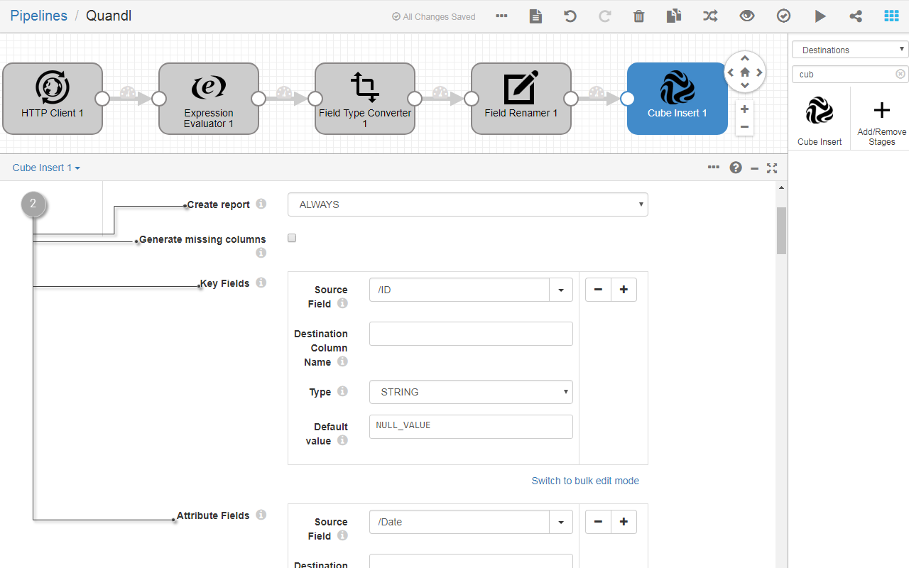
Fig. 51: Configure the Cube insert destination to store your data.
- Go to Data source editor and verify that a new cube has been created with the name
Quandl-FBand all the fields that you configured in the Cube insert destination.
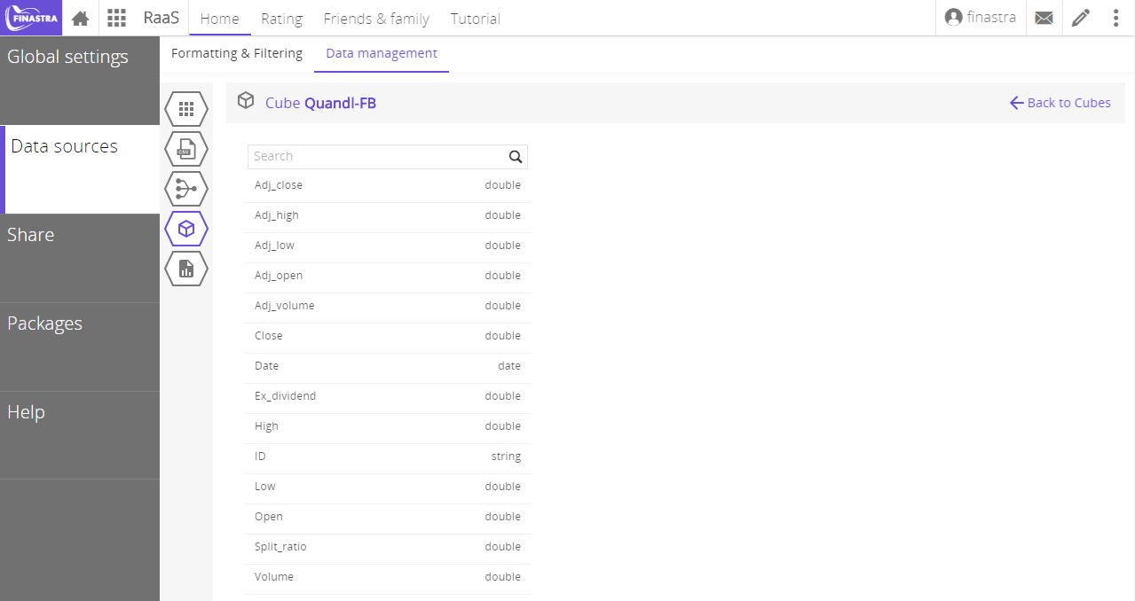
Fig. 52: Verify the creation of the Quandl cube after running the pipeline in .
Your data is now ready to be displayed in the UI of .
Process the Data in an App Builder Report
In this step you will add a custom attribute to your report: the OHLC indicator, computed as the average of Open, High, Low and Close prices:
\[\begin{equation} \text{OHLC} = {\text{Open} + \text{High} + \text{Low} + \text{Close} \over 4} \end{equation}\]
To add a custom attribute to your report
- In the Data source editor, open the Reports section and select the Quandl-FB report. The report configuration page opens.
- Click Add attribute. The Add attribute wizard opens.
- At the Select Type step, select Transform. You will add an attribute based on a transformation of existing attributes.
- Select Result type:
double - Select Operator:
Sum. This will be the default aggregation method for this attribute. - Copy the following code and paste it into the code editor text box. You are using JavaScript to compute the OHLC based on the existing report attributes.
var result = (_report_open_ + _report_high_ + _report_low_ + _report_close_)/4;

result;- Enter the Attribute name:
OHLCand click Add transform attribute. The attribute definition is added to the report. Its values are computed each time the attribute is queried.
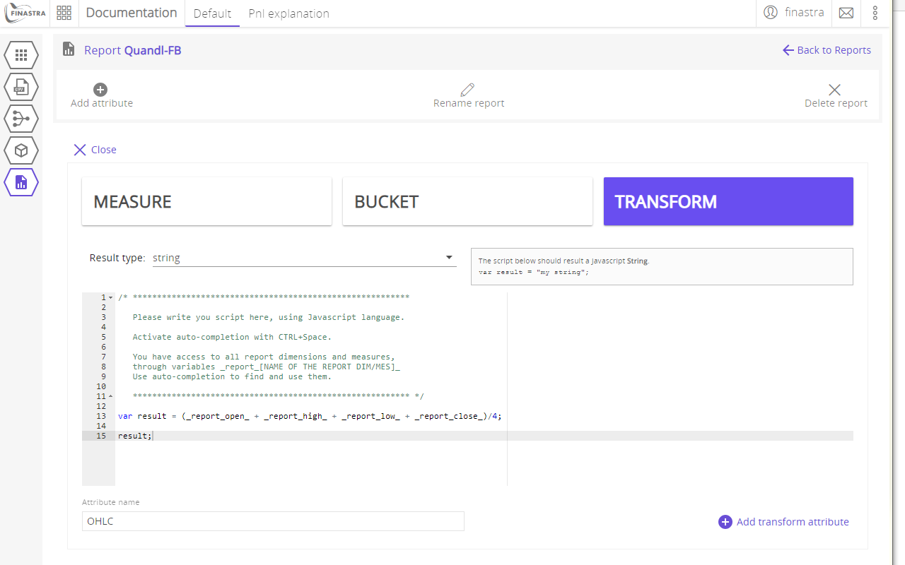
Fig. 53: Compute the OHLC as a transform report attribute.
You are now ready to use OHLC for data visualization.
Display the Data in the UI
Set up the Layout
To set up the UI layout
- Create a new workspace and name it Quandl.
- In the Quandl workspace, add a new board with the layout shown in fig. 54, and name it Option Pricer.
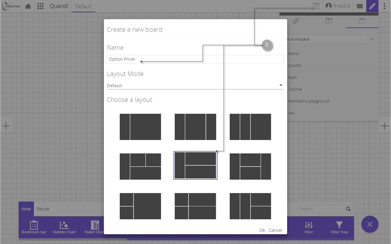
Fig. 54: Create the Option Pricer board to display the data.
You have now a dedicated workspace and a board that you will use to display the data, perform the pricing computation and display the results.
Display a Summary Table
To display the data as a table
- Go to the Quandl workspace and open the Option Pricer board.
- Switch to Design mode and select the bottom right frame. This is the location where you will add a summary table of the data retrieved from Quandl.
- In the component toolbar, search for table and click the Table widget. A table is assigned to the frame you selected at the previous step.
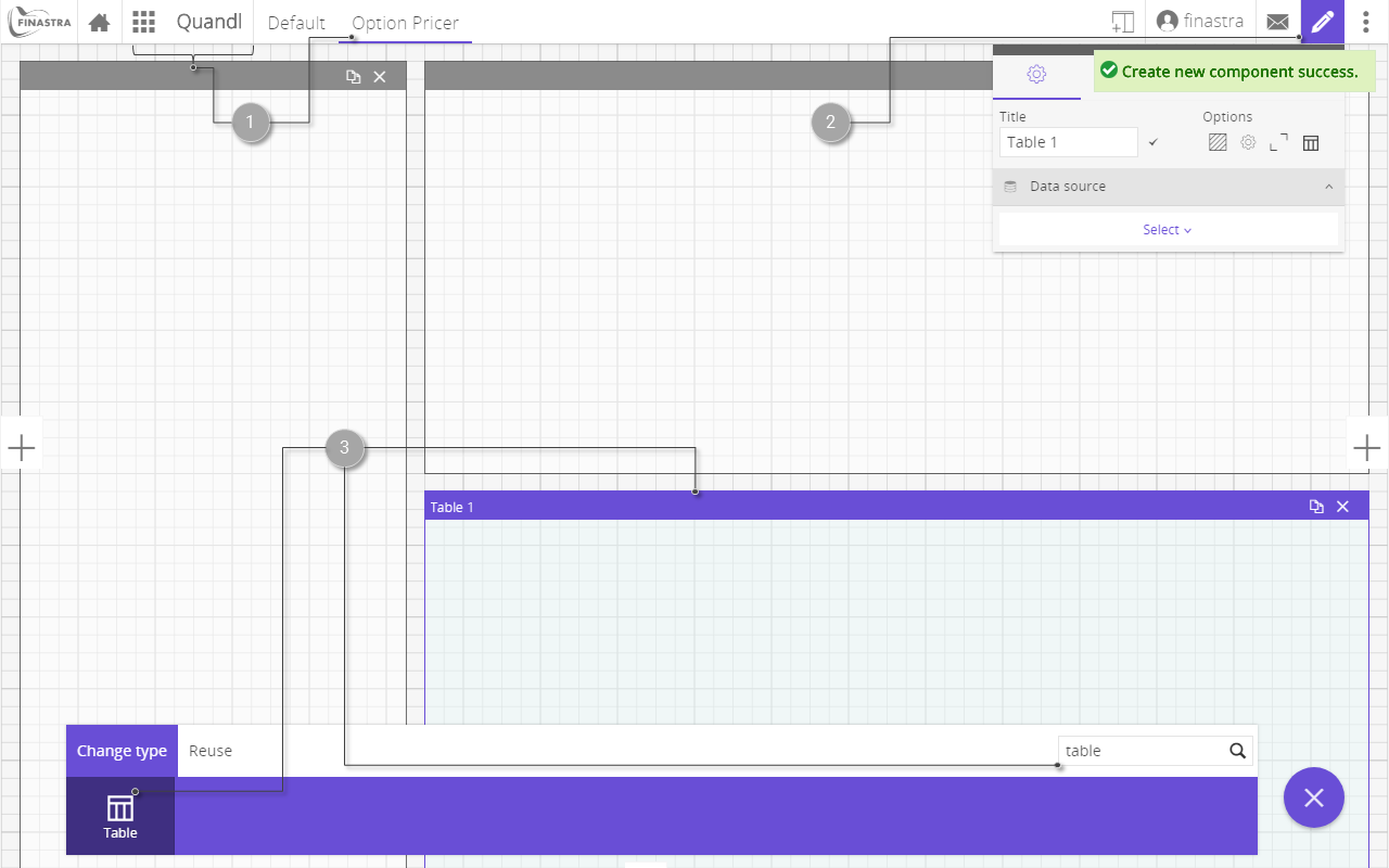
Fig. 55: Create the table to display the historical data.
- Configure the table component as follows:
- Title:
Summary table. - Data source: select the
Quandl-FBreport. - Columns: select all but
Date BucketandID. - Order the Date field in descending order by
DESCLeave the defaults for the rest of the configuration, but feel free to explore different settings for the table.
- Title:
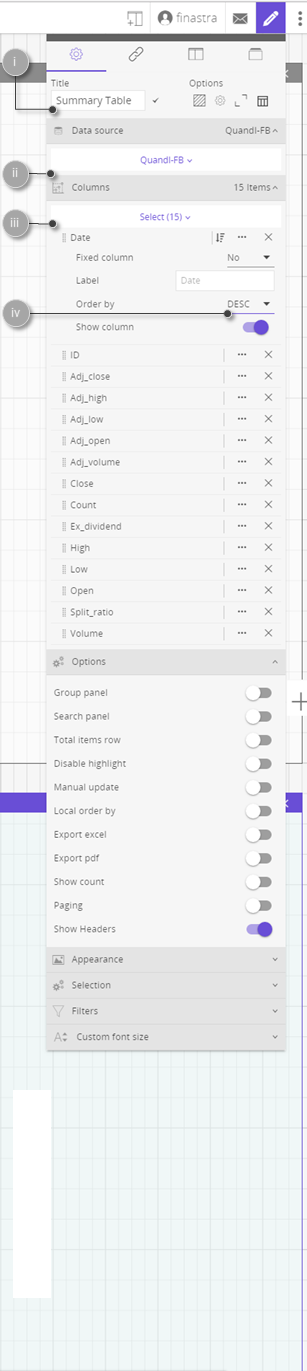
Fig. 56: Configure the table to display the data.
- Switch off the Design mode to visualize the table in the Option pricer board.
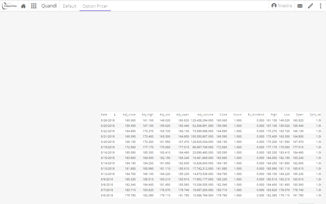
Fig. 57: The table with historical equity data of Facebook.
Display a Time Series Chart
To display the data as a time-series chart
- Go to the Quandl workspace and open the Option Pricer board.
- Switch to Design mode and select the upper right frame. This is the location where you will add a time-series plot of the data retrieved from Quandl..
- On the components toolbar, find and select the Chart component.
- Configure the chart as follows:
- Title:
FB shares time series - Data source:
Quandl-FBreport. - Horizontal axis:
Date, ordered ascending. - Vertical axis: select
OHLCto add the series on the plot. - Chart type: select
Splineto use a smooth curve. - Appearance: select Disable dots, to remove the data points from the curve.
- Leave the defaults for the rest of the configuration, but feel free to explore different settings for the chart.
- Title:
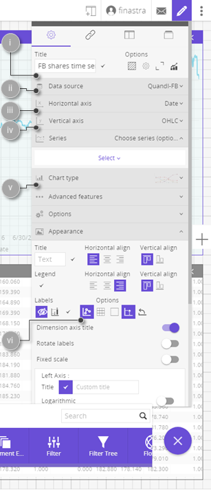
Fig. 58: Configure the time series to display the historical equity data.
- Switch off the Design mode to visualize the time series plot in the Option pricer board.
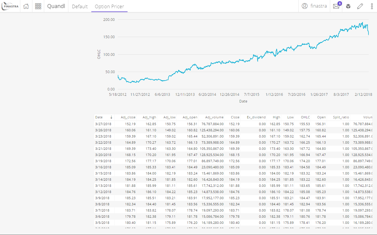
Fig. 59: The time series plot of Facebook historical equity data.