Join Rating and Exposure with the Data Manipulation Tool
In this section you will learn to use the Cube processor cube stage that you are provided with in Data Manipulation Tool. It allows you to retrieve, manipulate and store the data in cubes.
To find out more about cubes, see Data Source Editor documentation.
Use the Cube Processor Stage
In this section you will add a cube processor stage to your existing Get Exposure per Customer Rating pipeline. Therefore, the Exposure cube and its associated report will be updated accordingly.
To join data using a Cube Processor stage
- In the Data source editor, click DATA MANIPULATION.
- With the Exposure per Customer Rating pipeline in Edit mode filter out the Stage library, by selecting Processors, to display only the processors stages.
- In the stage search box, start to type
cubeand select the Cube Processor stage from the filtered list. - In the Configuration section of the stage, click the Cube tab and fill the Cube Name field with the name of the cube where you want to search for values:
Rating. - Fill the Lookup fields with the appropriate values, as follows:
- Field:
/Customer- the name of the field that provides the key values. This is a field from the input data of the Cube Processor stage. You must use the syntax/<field_name>. The slash (/) is mandatory. - Column name:
Customer- the name of the column from the lookup cube that stores the matching values.
- Field:
- Fill in the Columns to retrieve fields as follows:
- Column name:
Rating- the name of the column whose values will be used to enrich the data, according to the matched entry. - Destination field:
/Rating- the destination field where you want to store the lookup values. You must use the syntax/<field_name>. The slash (/) is mandatory. - Default Value:
NO RATING
- Column name:
- Make sure you keep Fill with default values selected.
- For details about the values, point your mouse to .
- Re-arrange the stages so that the output of the Field Pivoter 1 stage is plugged into the input of Cube Processor 1 processor stage and the output of Cube Processor 1 is plugged into Cube Insert 1 destination stage.
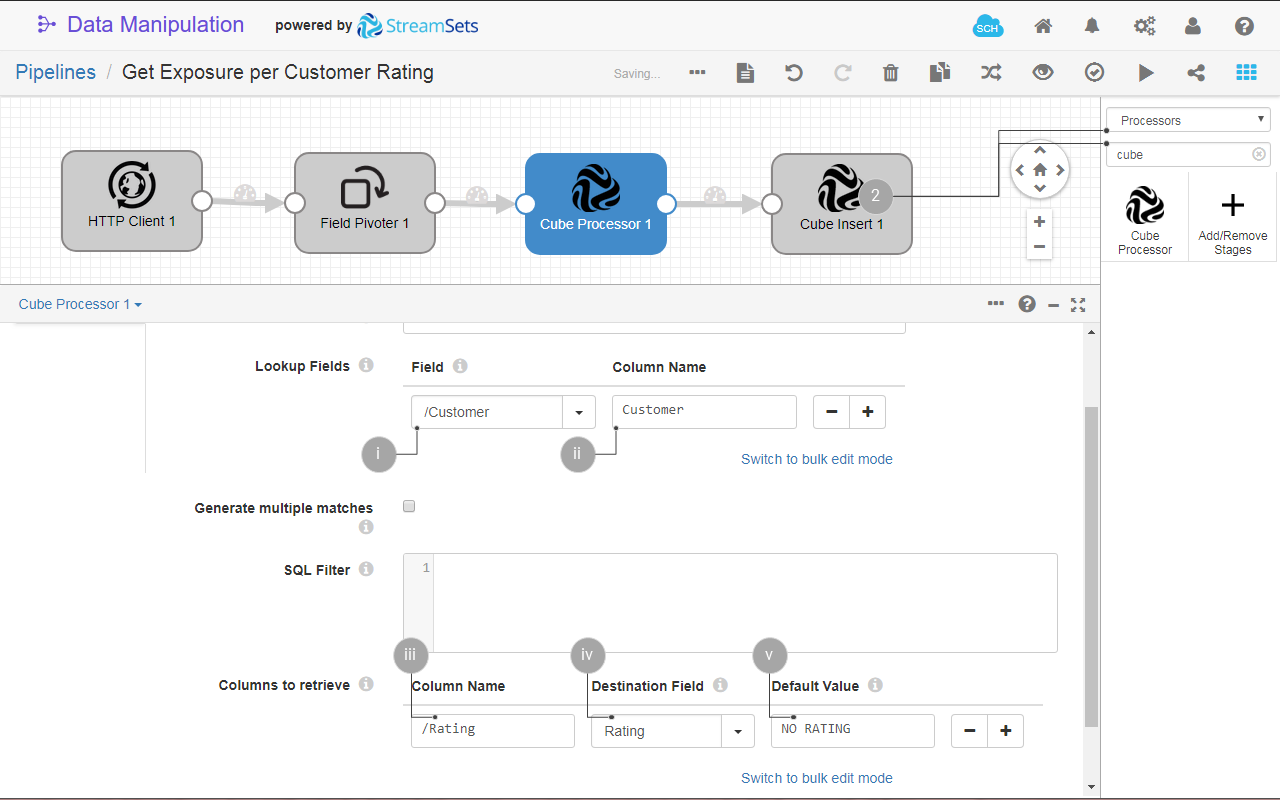
Fig. 26: The Cube Processor processor configuration.
- Run the pipeline.
- (Optional) In Data source editor go to CUBES and verify that the Exposure cube has been re-created. Click its name from the list to see its columns. Here you verify that the new Exposure cube contains a Rating column. Similarly, the Exposure report was re-created, with a new attribute - Rating.
To find out more about the Cube Processor stage, see App Builder Documentation
View the Joined Data on a Chart
To display your data on a chart
- Click to switch the UI to design mode.
- Create a frame on the lower-left side of the board. This is the location where you will add a bar chart of your data.
- On the Components bar, find and select the Chart component.
- Configure the chart as follows:
- Title:
Exposure per Customer Rating. Also click to show the chart title. - Data source - search and select the Exposure report.
- Horizontal axis - select Rating.
- Vertical axis - select Amount.
- Series - select Customer.
- Chart type - select Stackedbar.
- Appearance:
+ toggle to show the legend. - Leave the defaults for the rest of the configuration. You can explore different settings for your chart.
- Title:
- Turn off the Design mode to visualize the bar chart on the Overview board.
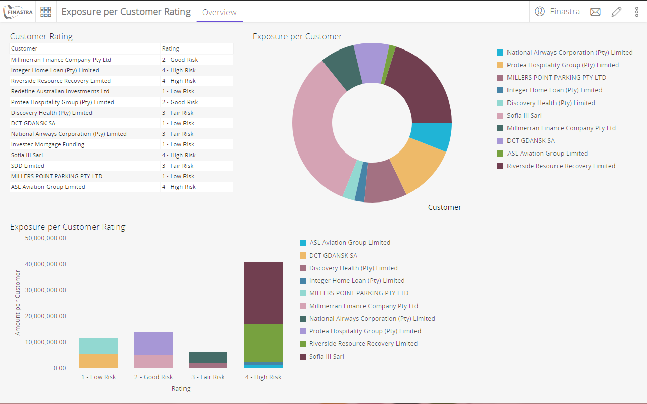
Fig. 27: The bar chart component.
Fine-tune Data in the Reports
In this section you will change the aggregation method of a report attribute. This allows you to create a new visualization, without modifying the data. Remember that reports are views, on top of the cubes, that you can customize for the needs of your report. You will aggregate on average the Amount attribute and so, you will create a chart that displays the average exposure.
To change the aggregation method of report attribute
- In the Data source editor, click REPORTS.
- Select the Exposure report from the list.
- Click Add attribute and select MEASURE. You will the aggregation method of a measure attribute, therefore the new attribute will be of the same type.
- Select the Aggregation type:
Avg. - Select the attribute in Arg1:
Amount. Note the list contains only the measure attributes. - Enter the name of the new attribute:
Average amount, and then click Add measure attribute. The new attribute is added to the list of measure attributes. Remember, it contains the same data as the existingAmountattribute, but it differs by the aggregation method.
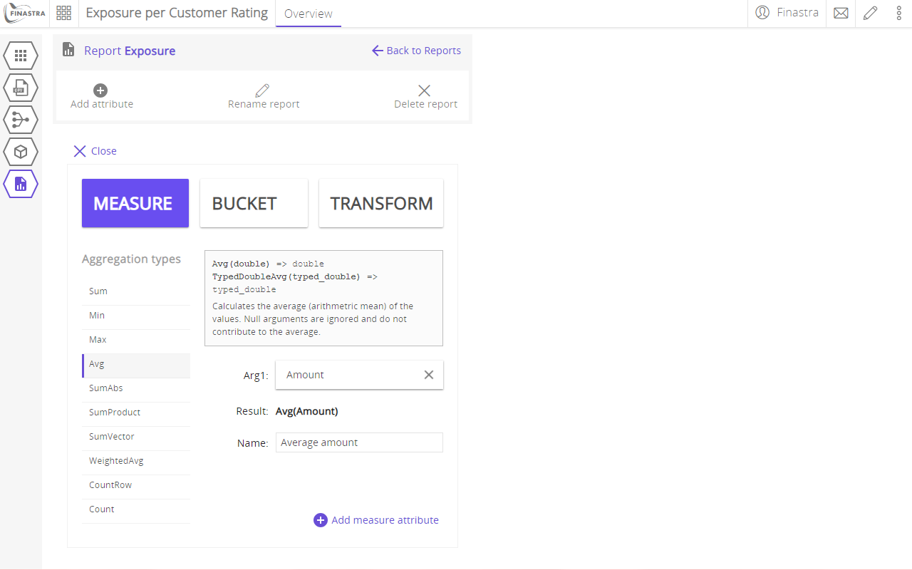
Fig. 28: The selection of the aggregation method on a report attribute.
View the new attribute on a chart
To display your data on a chart
- Click to switch the UI to design mode.
- Create a frame on the lower-right side of the board. This is the location where you will add a bar chart of your data.
- On the Components bar, find and select the Chart component.
- Configure the chart as follows:
- Title:
Average Exposure per Customer Rating. Also click to show the chart title. - Data source - search and select the Exposure report.
- Horizontal axis - select Rating.
- Vertical axis - select the new measure Average amount.
- Series - select Customer.
- Chart type - select Bar.
- Appearance:
+ click to show the legend. - Leave the defaults for the rest of the configuration. You can explore different settings for your chart.
- Title:
- Turn off the Design mode to visualize the bar chart on the Overview board.
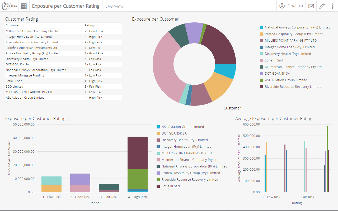
Fig. 29: The bar chart component.