Import Exposure via REST API Calls
In this section you will learn to use the Data Manipulation Tool, a tool based on Streamsets Data Collector, an open source low-latency ingest infrastructure application used to import, transfer, load and process data for later usage or storage in a database.
You will use a more complex scenario of importing exposure data from a Finastra open API.
To find out more about see the FusionCreator App Builder Documentation.
Get Started with Data Manipulation Tool
To get started with Data Manipulation Tool
- In the Data source editor, click DATA MANIPULATION. The page opens and the list of the pipelines that you created is displayed.
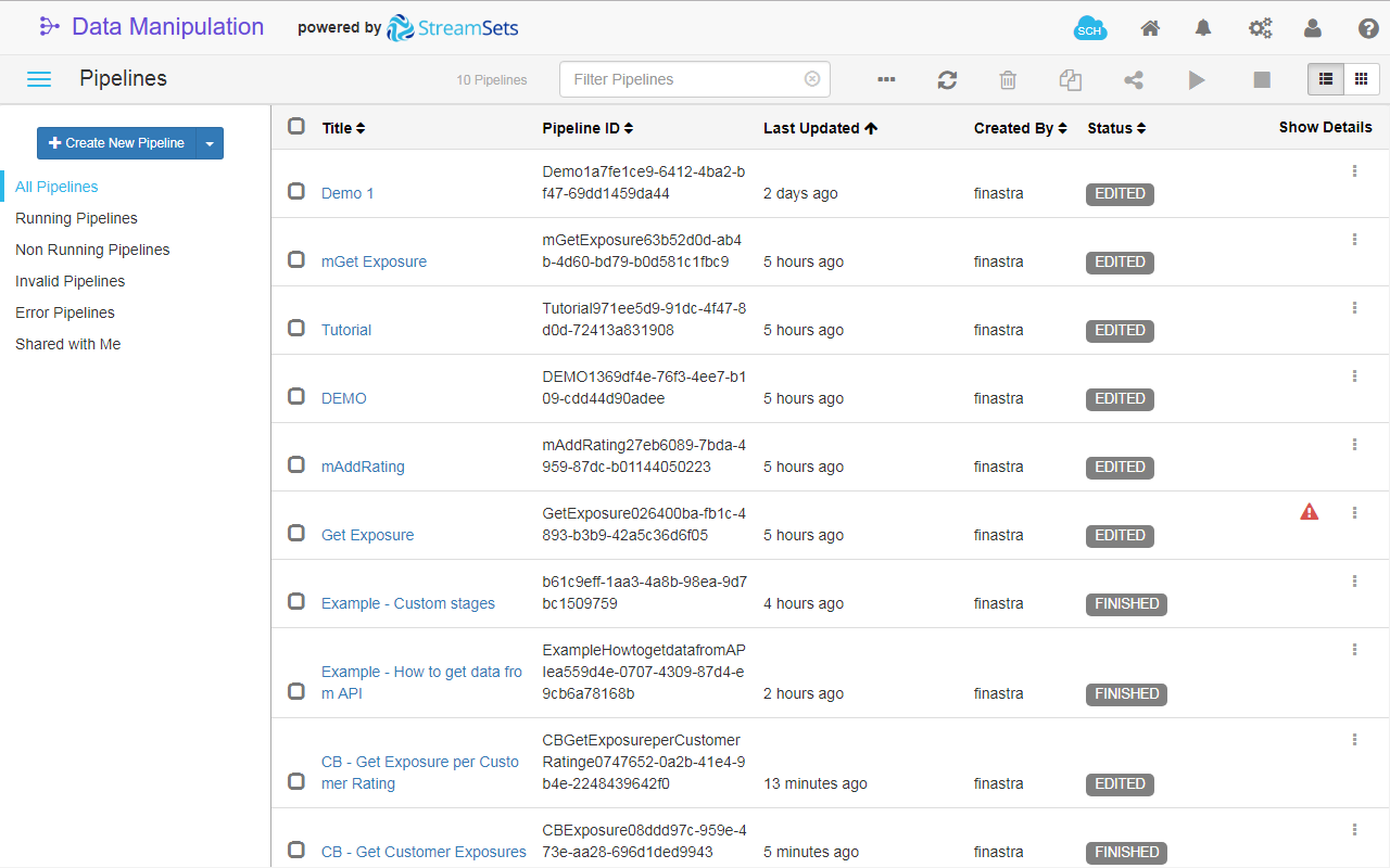
Fig. 19: The Data Manipulation Tool page.
- Click Create New Pipeline on the toolbar.
- Enter the Title of the new pipeline:
Get Exposure per Customer Rating - Click Save. The UI page switches to Edit mode.
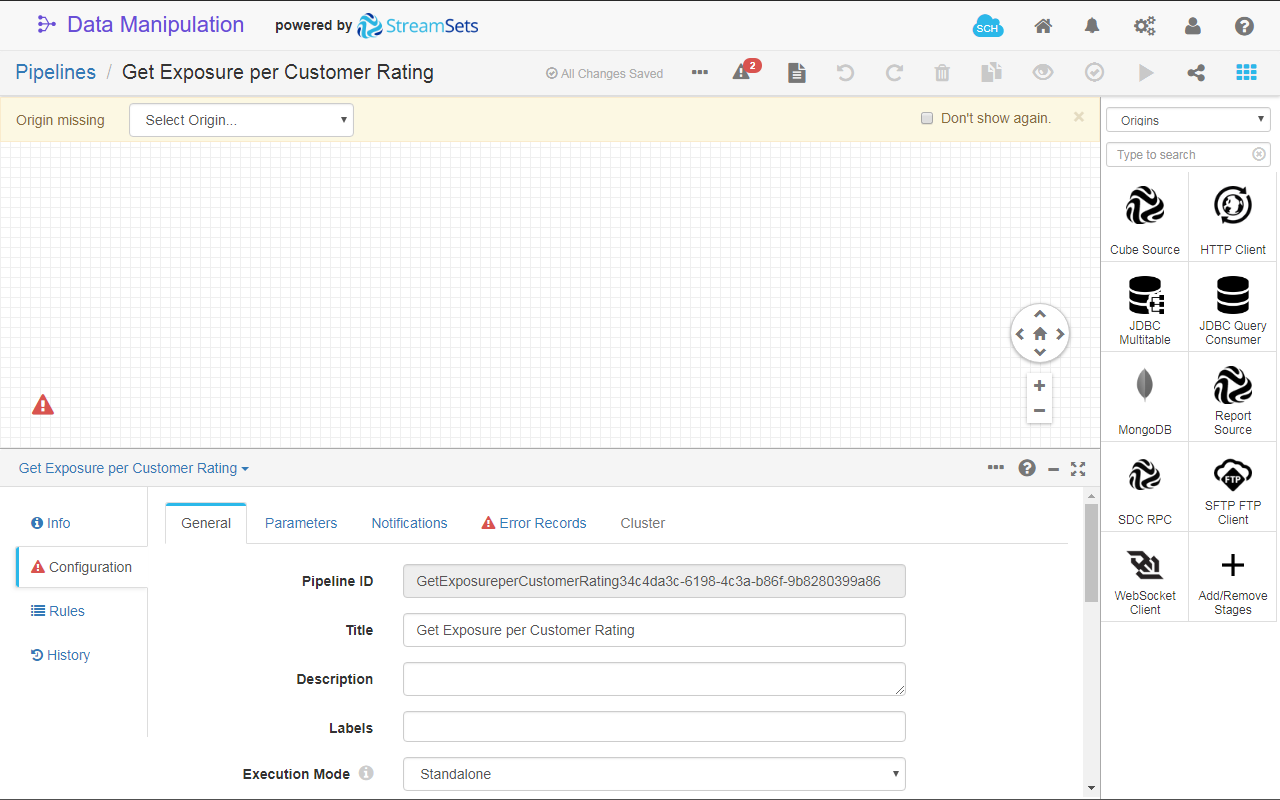
Fig. 20: The Data Manipulation Tool page in pipeline editing mode.
- On the Configuration section, go to Error Records tab and select
Discardfrom the Error Records drop-down list. The pipeline error handling is now configured to discard the record. This will prevent the pipeline to break if something goes wrong while it is running. To find out more about pipeline error record handling, see the Data Manipulation Tool documentation.
To find out more about pipeline configuration, see the Data Manipulation Tool documentation.
Design a Pipeline for Data Import
For this section you must subscribe to Fusion Hello World Datasource product in the API Catalog. For details, see Get Started with Finastra Open APIs tutorial.
To retrieve the data with an origin stage
- With the newly created Get Exposure per Customer Rating pipeline in Edit mode, filter out the Stage library, by selecting Origins, to display only the origin stages.
- In the stage search box, start to type
http clientand select the HTTP Client stage from the filtered list. - In the Configuration section of the stage, click the HTTP tab.
- Fill in the following fields:
- Resource URL:
https://api.sandbox.fusionfabric.cloud/HelloData/V1/retail/data1 - Headers: click , and add the following request header:
- Name:
Ocp-Apim-Subscription-Key- here you provide the API subscription key; for details, see Get Started with Finastra Open APIs tutorial. - Value: copy the key from your API Developer Portal profile and and paste it here.
- Name:
- Mode:
Batch
- Resource URL:
- Leave the defaults for the rest of the fields. For details about the values, point your mouse to , next to the field name.
- In the Configuration section of the stage, click the Data format tab and modify the following parameter:
- Max Object Length to
40960.
- Max Object Length to
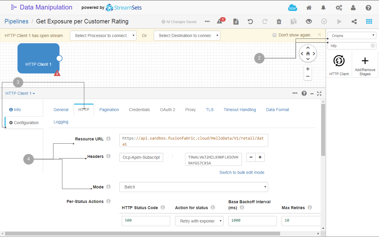
Fig. 21: The HTTP Client origin configuration.
To find out more about origin stages, see the documentation.
To process the data with a processor stage
- Filter out the Stage library, by selecting Processors, to display only the processor stages.
- In the stage search box, start to type
field pivoterand select the Field Pivoter stage from the filtered list. The Field Pivoter processor stage is added to your pipeline. - Link the output of the HTTP Client origin to the input of the Field Pivoter processor.
- In the Configuration section click the Field Pivot tab.
- Fill in the following fields:
- Field to Pivot:
/ - Copy All Fields: unselect this option.
- Field to Pivot:
- Leave the defaults for the rest of the fields. For details about the values, point your mouse to , next to the field name.
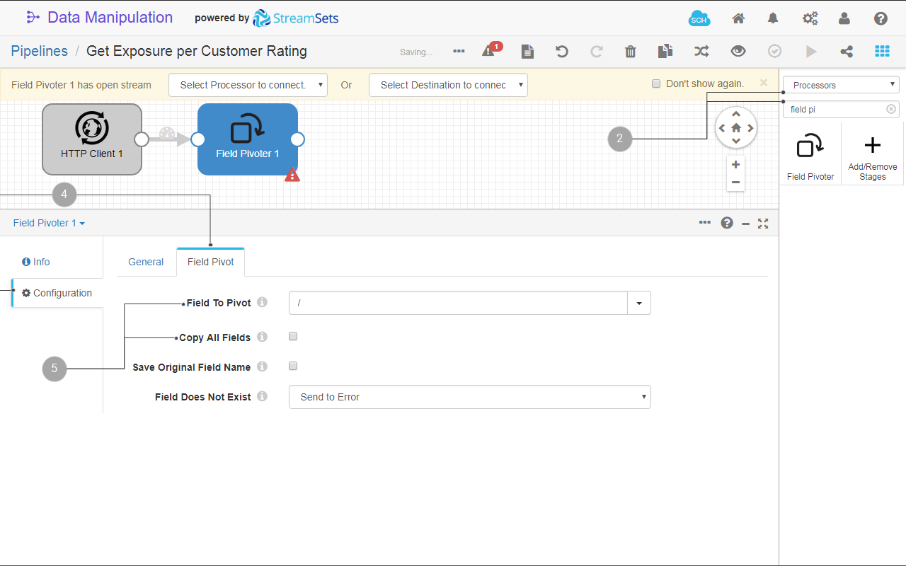
Fig. 22: The Field Pivoter origin configuration.
You use the field pivoter to expand the nested JSON data structure that you received with the HTTP Client origin stage into a tabular data structure.
To find out more about processor stages, see the documentation.
To store the data using a destination stage
- Filter out the Stage library, by selecting Destinations, to display only the destination stages.
- In the stage search box, start to type
cube insertand select the Cube Insert stage from the filtered list. The Cube Insert destination stage is added to your pipeline. - Link the output of the Field Pivoter processor to the input of the Cube Insert destination.
- In the Cube Insert configuration tab click the Cube tab.
- Fill in the following fields:
- Cube Name:
Exposure. A new cube with this name will be created. - Create report: select ALWAYS from the list. A report with the same name will be always created when you run this pipeline.
- Key Fields: fill in the following fields of the first key field:
+ Source field:/Id - Value Fields: you have only one value field in your data. Enter the following details for the first value field:
+ Source Field:/Amount
+ Type: Double
- Cube Name:
- Leave the defaults for the rest of the fields. For details about the values, point your mouse to , next to the field name.
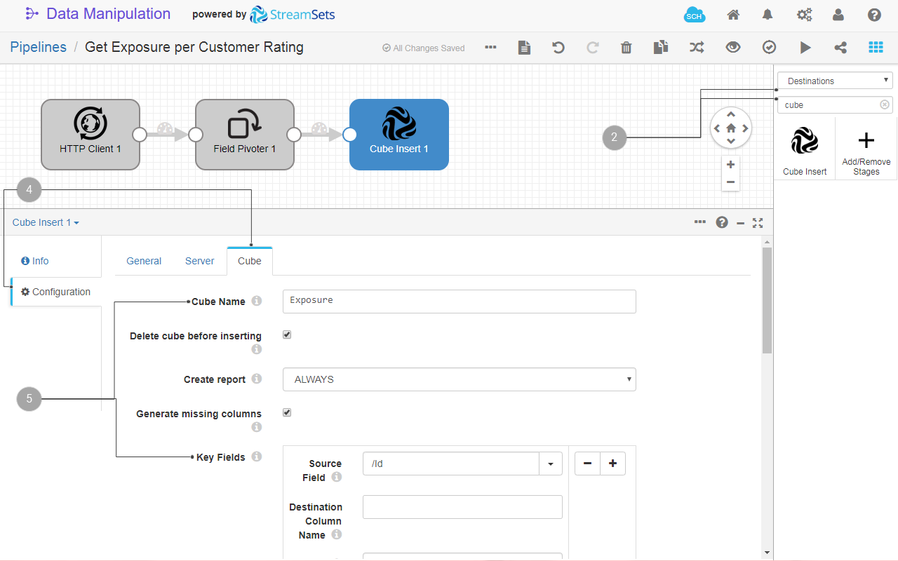
Fig. 23: The Cube Insert destination configuration.
- Run the pipeline. A confirmation message is displayed when finished.
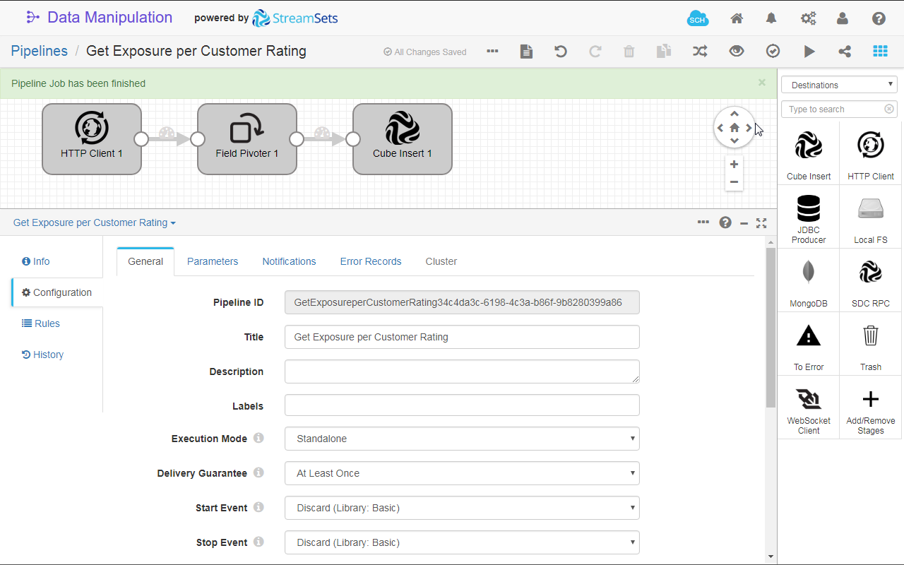
Fig. 24: The confirmation message at the end of a successful pipeline run.
- (Optional) In Data source editor go to CUBES and verify that the Exposure cube has been created. Click its name to see the columns. Also, go to REPORTS and verify that the Exposure report has been created, and click its name to see the attributes.
To find out more about destination stages, see the documentation.
Visualize the Data in a Chart
To display your data in a chart
- Click to switch the UI to design mode.
- Create a frame on the upper-right side of the board. This is the location where you will add a pie chart of your data.
- On the Components bar, find and select the Pie Chart component.
- Configure the chart as follows:
- Title:
Exposure per Customer. Also click to show the chart title. - Data source - search and select the Exposure report.
- Measures - select Amount.
- Dimensions - select the Customer column from the list of dimension columns.
- Chart type - select Doughnut.
- Legend - toggle the Visible option display the legend.
- Leave the defaults for the rest of the configuration. You can explore different settings for your chart.
- Title:
- Turn off the Design mode to visualize the bar chart on the Overview board.
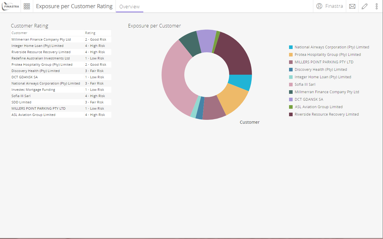
Fig. 25: The pie chart component.